Thursday, December 9, 2010

Snowboard Design


Create a graphic design for your own Snowboard


Resources:http://www.jorgefino.com/

Wednesday, November 17, 2010

Product Advertisement Project


ASSIGNMENT PURPOSE:
To design and produce material promoting an existing Product to a specific targeted market audience .

SKILLS AND KNOWLEDGE TO BE TESTED:
Design, graphics and layout skills used to create a promotional material. Design students will
create a theme and visual concept that will be applied to 3 Promotional pieces.

1) A Poster (10X16)
2) A Magazine Cover featuring the product (front cover only)
3) Choose one (1) of the following as your third
item:
i) T-shirt (8” wide by 8” high)
ii) Button (5” x 5” maximum)
iii) Website (home page only) (8” wide by 6” high)

Product logo and tag lines are required graphic element.
Also required is a Christmas theme

Additional copy, text, and images should be included to support the concept/theme.
All material must reflect the theme and be consistent in content. The design used must be
the original and creative work of the individual.

Any other stock photography and illustration that are not created by you will not be acceptable and will receive a zero mark. All photography and illustrations must be original and in full colour. A min of 10 original photograph must be submitted on a CDR.

The poster dimensions: 10” by 16” to allow for full bleed and trim. The poster can be
either horizontal or vertical. The brochure cover dimensions: 3.7” wide by 8.5” high
The t-shirt dimensions: 8” wide by 8” high
The button dimensions: 5” x 5” maximum
The webpage dimensions: 8” wide by 6” high
Trim all pieces to their correct size. No white border should be visible unless it is part of
the design

The three (3) pieces are to be mounted on a black
Display Board: 30” by 20”

All dimensions will be measured and marked accordingly.

Due date: TBA

Resources and Ideas:
1) Christmas theme: http://www.emuti.com/Collection-Christmas-2010-WoodlandsBrown.html

Tuesday, November 9, 2010

Type Face: A self portrait using types and fonts Project

Instructions: Due date: Dec 15th, 2010

Using only Types and Fonts create a self portrait of yourself. You must use Adobe Illustrator or CorelDraw and the workspace dimensions are 8.5 X11 inches. For your reference, I have attached examples.


Wednesday, October 20, 2010

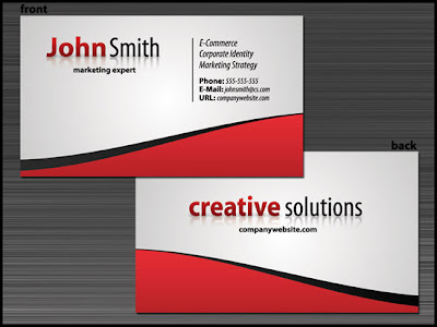
Create a Slick Business Card Design with Stunning Typography


Whatever profession you’re in, there’ll come a time when you’ll need your own business card. This graphic design tutorial will show you a way to create a standard two-sided business card design in Adobe Photoshop that you can take to your printer.


Your task is to complete the tutorial and create your business card and letter head Due date: TBA

Tutorial:

sixrevisions.com/tutorials/photoshop-tutorials/create-a-slick-business-card-design-with-stunning-typography/


Graphic Design Rubric

Tuesday, October 12, 2010

Yearbook Cover Design Assignment-Due date Oct 19th

Creating the cover of your yearbook will be one of the most important jobs you take on during the year. After all, the cover will almost always be the first element of the book that readers will see.

Whether you work with one of the designers from Herff Jones Creative Services Department on a custom cover or you design the cover yourself, you will need ideas. Which is where the Cover Gallery comes in. Scroll through and take a look at some of the covers that were created last year.

Final due date: Your task is to complete a Yearbook Cover design by Tuesday Oct 19th. Class presentation and critique 10%.

Requirements:

  • Theme or Concept: must come up with either one and present it to the class bu Oct 19th
  • Must have the school name and year on the book: Marshall McLuhan 2010/2011
  • Size: 8 1/2 X 11 (front cover)
  • Size: 8 1/2 X 11 (back cover)
  • 1 1/2 inches for spine
  • Must be in Vector format (CorelDraw) or if you use Photoshop the resolution must be 300 dpi minimum
Resource Links:
  1. Walsworth Yearbooks
  2. http://www.yearbooks.biz/?event=Showcase.Gallery&category=1
  3. http://yearbooks.lifetouch.com/get-ideas

Gap to Scrap New Logo, Return to Old Design-- News release

NEW YORK (AdAge.com) -- Just four days after confirming its surprise new logo was, in fact, legit, Gap is returning to its old design, Ad Age has learned. The announcement is expected to be made at 4:30 Pacific Time today on the brand's Facebook page.


Marka Hansen, Gap North America president, informed the company's marketing department this afternoon of the change, acknowledging that the switch was a mistake and that the company would be tabling any changes for the foreseeable future.

The logo, created by New York agency Laird & Partners, was intended to be a long-term commitment for the brand with a nod to the future. Ms. Hansen's about-face about the Gap's new logo was foreshadowed by a blog post she wrote for the Huffington Post last Thursday. "We chose this design as it's more contemporary and current. It honors our heritage through the blue box while still taking it forward," she said. "Now, given the passionate outpouring from customers that followed, we've decided to engage in the dialogue, take their feedback on board and work together as we move ahead and evolve to the next phase of Gap."

Calls to Laird & Partners were not immediately returned.

Gap representative Louise Callagy also told Ad Age that the logo debacle does not mean that it has ended its relationship with Laird & Partners. "We are still engaged," she said. "Given this response, we decided to open it up. We'll explain more specifics in the next few days."

Gap posted a message on its Facebook page last night saying that in light of the response to its new logo it will be conducting a "crowdsourcing project."

"Thanks for everyone's input on the new logo! We've had the same logo for 20+ years, and this is just one of the things we're changing," The Facebook post reads. "We know this logo created a lot of buzz and we're thrilled to see passionate debates unfolding! So much so we're asking you to share your designs. We love our version, but we'd like to ... see other ideas. Stay tuned for details in the next few days on this crowdsourcing project."

Asked why Gap handled the rollout the way it did, Ms. Callagy said it was intentional. "Gap's target customer is the millennial, and we're exploring ways to communicate with them," she said. "On Monday, without a lot of fanfare, we introduced the logo on the Gap.com site. ... That's in line with them."

But what about the customers who feel betrayed by the way Gap up and changed the brand without cluing them in? "We're addressing that by opening it up and having everyone participate in the process," she said. "We'll see how it goes."


To read original story, click on the following link: http://adage.com/article?article_id=146353


Video Resource:
  1. http://www.youtube.com/watch?v=3mXSZdkH_kk
  2. http://www.youtube.com/watch?v=FruzXZLwI2E

The Gap's New logo


This past Monday, without a lot of fanfare, we introduced a new logo on our gap.com site, and I wanted to take this opportunity to explain our thinking behind this decision.

I've been president at Gap brand for the past three years, and I've been living and breathing the changes we've been making on our journey to make Gap more relevant to our customers.

You've seen this evolution through many of our products, such as the 1969 premium denim and the new black pants, and more modern stores in many locations.

The natural step for us on this journey is to see how our logo - one that we've had for more than 20 years - should evolve. Our brand and our clothes are changing and rethinking our logo is part of aligning with that.

We want our customers to take notice of Gap and see what it stands for today.

We chose this design as it's more contemporary and current. It honors our heritage through the blue box while still taking it forward.

Now, given the passionate outpouring from customers that followed, we've decided to engage in the dialogue, take their feedback on board and work together as we move ahead and evolve to the next phase of Gap.

From this online dialogue, it's clear that Gap still has a close connection to our customers, so tapping into this energy is right. We've posted a message on the Gap Facebook Page that says we plan to ask people to share their designs with us as well. We welcome the participation we've seen so far.

We'll explain specifics on how everyone can share designs in a few days.

Thank you to everyone who has already shared feedback. I'm excited about continuing the conversation and believe passionately in where we're taking our brand.


The Assignment: The Gap Inc. Logo Re-design--Due Oct 29th

The Gap Inc. ask people to share their designs. They welcome your participation and it's your opportunity to create your own logo for the Gap Inc.

Your task, therefore, is to redesign the Gap logo. All Logos must be Vector base and a maximum one colour: blue and two values (Black and White)

Thursday, September 16, 2010

Creative Process and Elements and Principles of Design

The elements of design are the building blocks of all designs, chosen to convey the message — beyond the actual words or photos used. Desktop publishing documents utilize the five elements of design : lines shapes mass texture color. Can you identify each element in your own designs?

Lines

Lines are one of the basic elements of design. Alone or in combination with other lines or shapes they can aid in the readability, appearance, and message of a design. Have you used lines to organize or guide the eye? Have you used lines to simulate texture or provide movement?

Mass

Mass equals size. Each piece you create has a physical mass. The physical mass or size is the actual dimensions of the piece — height, width, thickness/weight (of paper), and depth (3D objects). Additionally, each element within the design (graphics, photos, lines, text blocks) have their own mass relative to the whole piece. For example, a photo that is physically 3 inches by 5 inches can appear smaller or larger depending on the physical size of the paper it is printed on and the size and proximity (closeness) of other items on the page. Some ways to use mass within your designs:

  • to accommodate information, content Example: To present all the desired or needed information comfortably a designer may create a bi-fold rather than the usual single business card
  • to accommodate normal size restraints or expectations Example: The postal service has limitations on the height and width of different types of envelopes. If a designer ignores those requirements it could incur additional mailing costs for the client.
  • to convey a mood or provide emphasis Example: A place that is physically large (such as an amusement park) or a business that offers a huge assortment of products may use brochures or other marketing pieces that are larger (physical dimensions) or heavier (weight) than normal to carry out the 'bigger' or 'more' theme.
  • to create contrast Example: A designer might design a full-page magazine ad using a single small image in the middle of the page with lots of white space.

The contrast between the size of the page and the size of the content (image) draws attention to the image and can create a specific mood (depending on other elements) such as conservative, elegant, lonely, or open. Sometimes bigger isn't always better.

Take this brochure description for example: 23 1/4 x 16 1/2 inch full color two-sided brochure (folded twice to 8 3/4 x 11 3/4 inch). This brochures opens twice and is visually packed and appears massive due to the following elements:

  • It has a large physical size when opened
  • It is folded down numerous times, and although the paper is thin, glossy card stock, it appears massive due to the number of layers created by the folds.
  • It is densely packed (in my opinion, overwhelmingly over-packed) with bold, multicolored backgrounds and graphic elements, multicolored and shadowed text, and photographs - making it visually massive and heavy. The brochure is packed with information about the software and its applications. Look at ads, magazines, brochures, logos, and other printed projects with an eye on mass. Ask yourself why each item is as large or small as it is.

Hands-On Exercise

Look for four types of material in your collected design samples:

  • physically large pieces (larger than 'letter size')
  • physically small pieces (business cards, small space ads, tags)
  • physically large pieces that incorporate small or visually small elements and lots of white space * physically average or small pieces that incorporate large or visually large elements (such as a single dominate photo or huge headlines compared to other items on the page)

Friday, April 30, 2010

Notes on Digital Photography Workshop April 30th George Brown College

Some helpful links:

  1. www.photoshopuser.com
  2. www.dpreview.com
  3. www.lightroomuser.com

Shot in Raw files/Process Raw files

Camera raw file formats contain unprocessed data from a digital camera’s sensor. Most camera manufacturers save image data in a proprietary camera format. Lightroom reads the data from most cameras and processes it into a full color photo. You use the controls in the Develop module to process and interpret the raw image data for your photo.

DNG files

The Digital Negative (DNG) is a publicly available archival format for raw files generated by digital cameras. By addressing the lack of an open standard for the raw files created by individual camera models, DNG helps ensure that photographers will be able to access their files in the future. You can convert proprietary raw files to DNG from within Lightroom.

Jpeg Files

Joint Photographic Experts Group (JPEG) format is commonly used to display photographs and other continuous-tone images in web photo galleries, slideshows, presentations, and other online services. JPEG retains all color information in an RGB image but compresses file size by selectively discarding data. A JPEG image is automatically decompressed when opened. In most cases, the Best Quality setting produces a result indistinguishable from the original.

TIFF format (Tagged-Image File Format)

(TIFF, TIF) is used to exchange files between applications and computer platforms. TIFF is a flexible bitmap image format supported by virtually all paint, image-editing, and page-layout applications. Also, virtually all desktop scanners can produce TIFF images. Lightroom supports large documents saved in TIFF format (up to 100 million pixels with pixel dimensions of no more than 10,000 on a side). However, most other applications, including older versions of Photoshop (pre-Photoshop CS), do not support documents with file sizes greater than 2 GB.The TIFF format provides greater compression and industry compatibility than Photoshop format (PSD), and is the recommended format for exchanging files between Lightroom and Photoshop. In Lightroom, you can export TIFF image files with a bit depth of 8 bits or 16 bits per channel.

Thursday, April 29, 2010

Flash Portfolio Website

Using Flash MX create a interactive Website that shows all your graphic assignments in this course. Your interactive Website should have the following components:

1)Splash page
2)Home page
3)About Me page
4)Portfolio (must be done as a MovieReel)

Good Luck:)

Wednesday, April 14, 2010

McLuhan Yearbook Cover Assignment

"They say you can’t judge a book by its cover, but a good cover will help you sell more books."

Using Adobe Photoshop or CorelDraw, create a cover for the Notre Dame High School Yearbook. Take the suggested theme of the yearbook below and create—to the best of your abilities—a yearbook cover that will grab the reader’s attention.

Think of the school population and create a cover that will appeal to most of the students at Notre Dame. It is impossible to appeal to every student but try. When creating the cover, remember that the theme will have to be carried out throughout the book and of course, it has to be school appropriate.

The Cover
♦ 8.5 x 11 on white, blank paper (the actual cover will be a bit bigger)
♦ 300 DPI and in CMYK Colour Space
♦ The cover MUST have a central focus
♦ Should include the following Info:
Notre Dame High School
2010-2011
School crest and motto(option)

Themes:
A time for change
A galaxy of possibilities
A glance back
A gold standard
Above the crowd
Absence of moderation
Abstractions
etc...
or make up your own theme:)

Monday, March 22, 2010

Portrait using types and fonts

Brief Instructions:

Using only Types and Fonts create a portrait of yourself or someone. You must use CorelDraw and the workspace dimensions are 8.5 X11 inches. For your reference, I have attached examples.


Multicultural Festival Poster Assignment

PURPOSE OF THE ASSIGNMENT:
To design and produce material promoting Multiculturalism to students, aged 16 -21


SKILLS AND KNOWLEDGE TO BE TESTED:

Design, graphics and layout skills used to create a promotional material. Participants will create a theme and visual concept: “Multicultural Festival” Poster Assignment due by 3:30pm Wednesday March 24th, 2010

Your task: is to create a Poster for Notre Dame Multicultural festival. The Poster must have the title, “Multicultural Festival” and logos (TCDSB logo, McLuhan crest, and our sponsor's logo)

Info: Friday May 7th
12(noon) to 4pm
Cost $5.00

All material must reflect the theme and be consistent in content. The design used must be
the original and creative work of the individual competitor.

Stock photography and illustration are acceptable, as well generated by hand or by using
electronic equipment and appropriate software. Full colour may be used

The poster dimensions: 10” by 16” to allow for full bleed and trim. The poster can be
either horizontal or vertical.

"Smashed" Poster Assignment

PURPOSE OF THE ASSIGNMENT:

To design and produce material promoting Against Drinking and Driving to students, aged 16 -21


SKILLS AND KNOWLEDGE TO BE TESTED:

Design, graphics and layout skills used to create a promotional material. Participants will

create a theme and visual concept.

“Smashed!” Poster Assignment

due by 3:30pm Sunday March 26th, 2010


Mothers Against Drinking and Driving, The National Highway Traffic Safety Administration (NHTSA) and the Toronto Police are dedicated to keeping the roadway clear of drunk drivers this Summer holiday and, as a result, they have created a number of promotional posters for bars, restaurants and retail establishments. These posters are designed to warn people against the dangers of drunk driving and do it by incorporating a bit of holiday flair in their message.


Your task: is to create a Poster for this Campaign with the provided images. The Poster must have the title, “Smashed” and the following MADD and Toronto Police logos.

All material must reflect the theme and be consistent in content. The design used must be

the original and creative work of the individual competitor.


Stock photography and illustration are acceptable, as well generated by hand or by using

electronic equipment and appropriate software. Full colour may be used

The poster dimensions: 10” by 16” to allow for full bleed and trim. The poster can be

either horizontal or vertical.

Wednesday, February 10, 2010